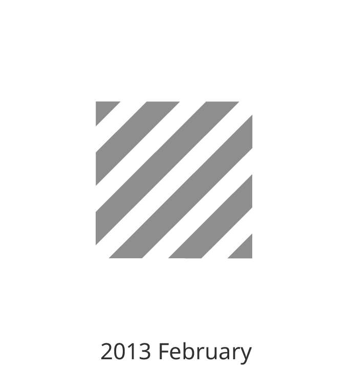
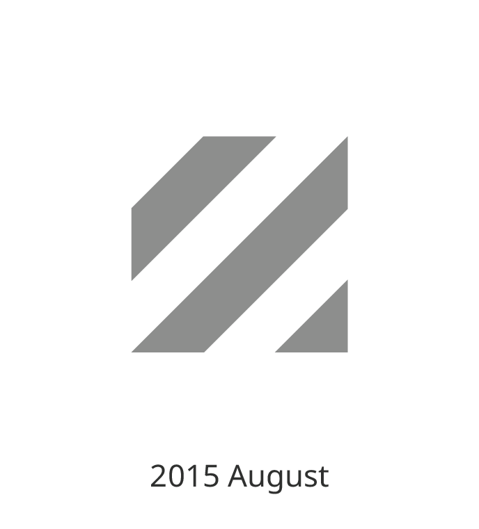
Evolution of My Personal Identity
My personal logo is something that I have been developing ever since I took Brand Identity Design course at RISD in 2012. I developed initial version of my logo, and have been refining it until now. Because personal identity plays great role in establishing the first impression, I used it sparingly in my namecard, websites, watch and printed portfolios.
Switching from 2D to 3D
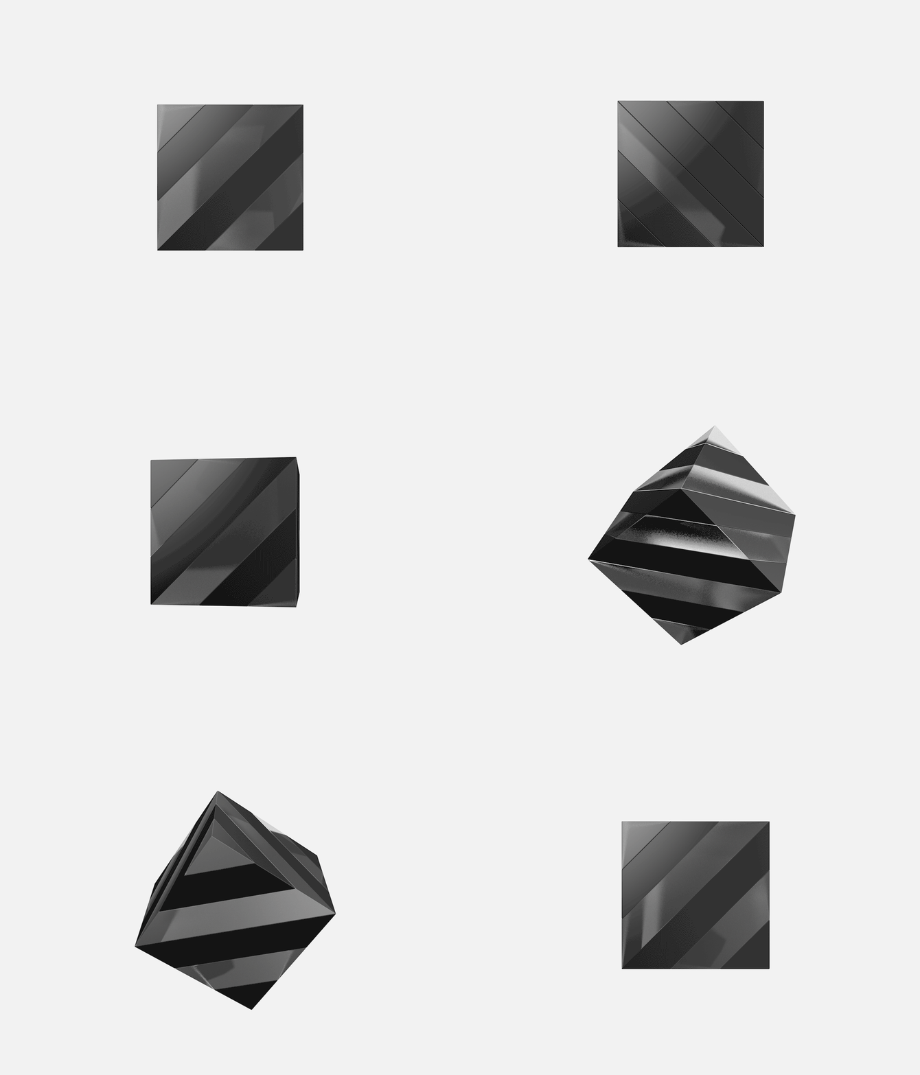
As some logos, such as Google Daydream logo, have 3D interpretation, I realized that transforming a logo into a 3D form can add visual complexity and meaning. 3D logo has more variables in its visual interpretation such as camera angle, texture, material, lighting, and volume. Because of this, I chose to evolve my 2D logo into a 3D logo. It was almost like a reverse-engineering, and backtracking a puzzle, trying to imagine what 3D shape would look like my 2D logo at a certain angle. Like all the times, this design began from sketches.
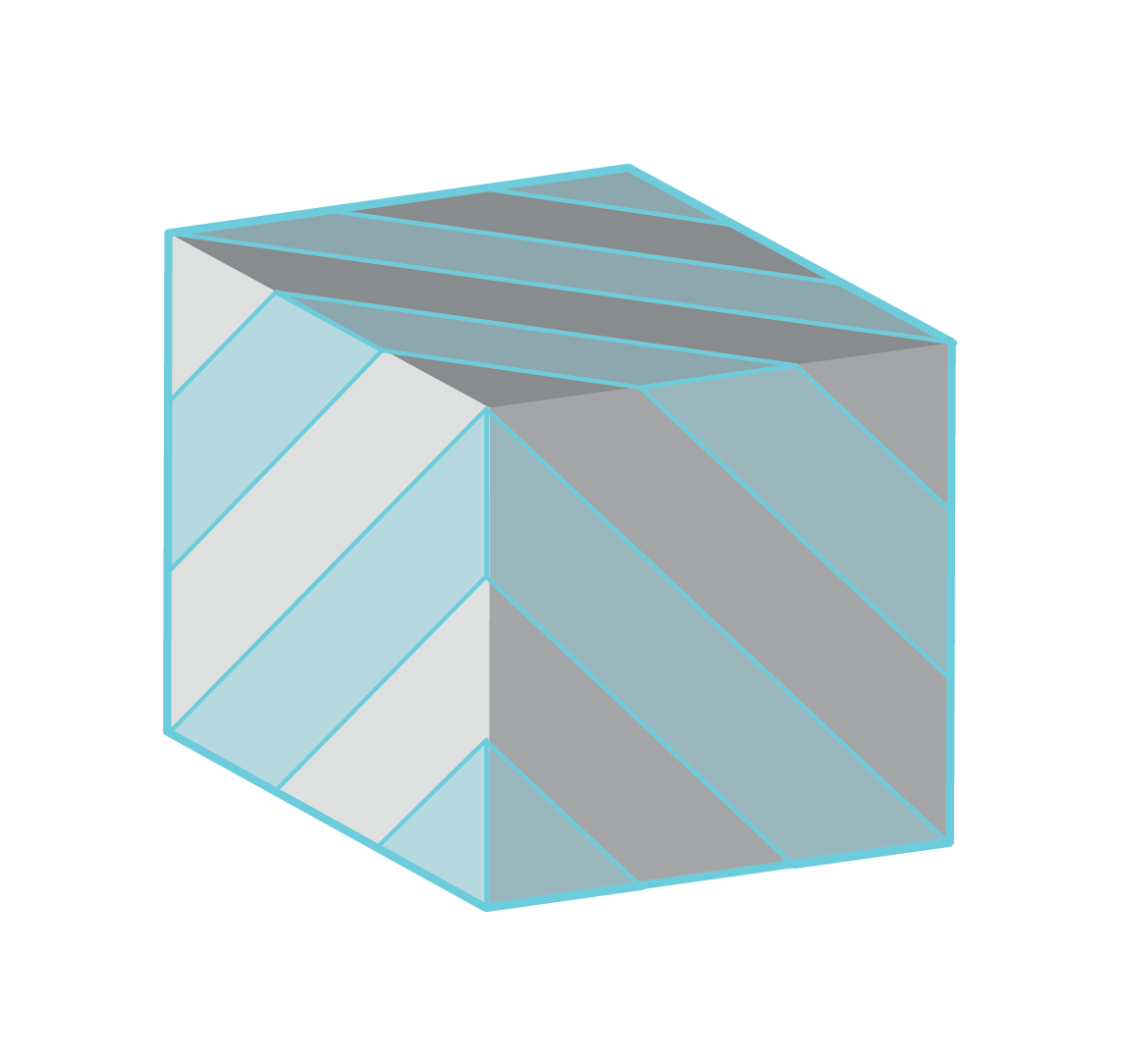
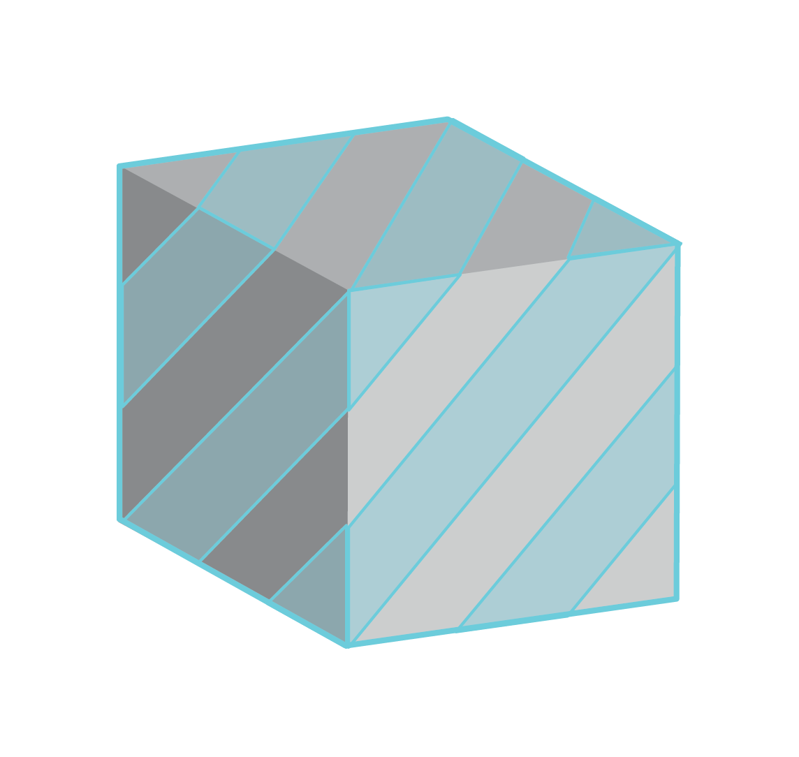
Looking at the basic geometrical divisions of my logo, I mapped this onto all facets of a cube. When this was completed, I realized that the cube can be divided into 9 pieces, which are stackable along the diagonal axis of the cube.
Modeling the logo in Rhino 3D
Transitioning the existing logo from vector blueprint onto 3D was a simple process as the logo was essentially a geometric primitive. The 3D logo became symmetric along diagonal axis of its cubic shape. I added small fillets along all edges to make the model more realistic.
Rendering with Cinema 4D
I've chosen black matt plastic and transparent glass for materials of this logo. The negative spaces of 2D logo is reinterpreted in spatial environment as refracted transparent object (frosted glass). The black logo is redefined as matt plastic.
Modeling rendered on Pixel, using ARCore


